Dual Screens == 2x Fun!

As Steph already said when she stole my thunder, I’m really looking to get one of these babies if they come out in time for Christmas. It’s looking like the Nintendo DS will come out in mid-November in America, or at least that’s the way the wind is blowing. No one knows for sure yet.

The DS looks like a handheld party with all the geeky drool factor you could ever ask for. Its primary feature is its dual screens (which is where the “DS” comes from) which open up interesting new possibilities for game design, creating new ways for the gamer to see and interact with the game. It’s got built-in Bluetooth, so you can wirelessly connect to other DS owners within a few meters of where you’re standing and play games with them on the spot. It also has WiFi (802.11b, I think?), so it can get on the internet from any wireless hotspot (including the ones in my house and at my work) and play games that way too! Oh, and you can do text chat with it.

It’s got a microphone, so programmers can make games that use voice recognition. I’m assuming the mic will have uses far beyond that, too. It also has a stylus, so you can write on it, use the stylus in games if the game is made that way, and chat with handwriting and doodles over the ‘Net as well.

It has so many interesting features, and Nintendo has never released a system I didn’t like, so I think this one is going to be a big hit with me. I mean, imagine playing Mario Kart: Double Dash!! with a few other people live over the Net totally wirelessly from the couch in your living room. Or imagine playing Animal Crossing live over the ‘Net. (They haven’t announced that the Animal Crossing game the DS will have will actually have online play, but it seems so obvious to me…) And the graphics are going to be more high-powered than the Nintendo 64, but on two tiny screens in the palm of your hand. That’s pretty sweet. If you’d really like to drown in way too much Nintendo DS information, check out this article on TooCubed.com.

It’s sounding like they’ll cost about $175. I’m hoping that’s true. I’m going to be permanently carrying a towel with me starting in late October because I won’t be able to stop drooling.

Redesign (Whoomp, There It Is)

OK, so here you have it! Just after midnight. There are certainly still bugs in this design, but we’re most of the way there. I’ve got a few other bobbles and extras I’ll be adding in the coming days and months, but this is the main look and feel for the thing. Watch the upper-right corner of the main white window for something fun in the coming days (or weeks if I’m really busy). I’m really hoping you’ll all give your honest feedback about it. Even the silent lurkers! It was extremely challenging to get it all to work even as well it does, but now that it’s up, it feels really rewarding.

Those of you who aren’t using Internet Explorer are probably being treated to the goodness known as PNG images. (Soon the IE users will also get to see the PNGs properly once I’m done making the necessary tweaks. Right now they unfortunately see ugly grey areas where the images are supposed to be transparent.) The “joshlewis.org” graphic at the top and the drop shadows and rounded corners on the main white window are all PNGs. Even the upper-left corner is rounded. You just can’t see it without removing the joshlewis.org graphic. But if you did, you’d see it under there.

My friend Eddie said something on this very blog a few months ago that I’ve had running around in the back of my web-developing brain since then. He said that websites (or at least a few that I made) look too boxy. I thought about that comment and I decided that I agreed enough to try to do something about it on my site. I don’t want it to be boxy, I want it to be beautiful. I want it to be layered and kinda pop out at you when you see it. Boxy flatness is a common problem, but most web designers satisfy themselves with either 1) looking boxy because it’s too hard not to, or 2) using lots of solid background colors that cover the entire page, thus giving the impression that it’s not their website that is boxy, but that it’s really just the browser window boxing them in. I didn’t want a solid color background, but I also didn’t want corners in my design. (You’ll notice that there is currently not a single right angle in this entire design.) So I sought out the wisdom of the web design geniuses at A List Apart, and I quenched my thirst with their article titled CSS Design: Creating Custom Corners & Borders Part II I didn’t end up following their recommendations to the letter. I had to improvise a bit because of a few differences in my code, but it turned out pretty well. It took me about four hours of intense negotiations with the CSS and XHTML to get it to work.

I’ll continue tweaking what you see based on your feedback over the next few weeks. You’ll notice that the individual entry pages and comments stuff haven’t really been tweaked much yet. I’ll get to it.

Update: w00t. It validates.
Update 2: I figured I’d post a JPG of what it’s supposed to look like so those using IE can see it now. (Then again, they could just download Firefox if they wanted a better browsing experience.)

Delays

I stayed up past 2am last night reading about how I’m going to do some stuff I wanted to have done before noon today, and due to a brief trip to Fry’s Electronics, it’s looking like the changes I’ll try to make today are going to be made after noon rather than before it. So please hang in there if you’re coming around here expecting to see some big change, or see the “orange” thing that everyone keeps buzzing about. I’ll probably be picking this blog apart piece by piece this afternoon, and it’s going to be a horrible mess. But I know you’ll be patient, and also use the comments on this entry to laugh at how strange it looks when it’s in mid-change.

Thanks. I know I can count on you guys.

Fear and Perfection

Steph and I were talking about my blog the other day, and she said that all the redesigns I’ve done of it (I think I’ve done four now, and she’s the only one who has seen all of them) were better than what I currently have, but for some reason I’ve stuck with what I currently have for well over a year now. The only reason I was able to give for that odd fact was that the other designs were never ready. She, being the artist, then taught me that nothing is ever ready, and it’s better to put whatever you’ve got out there for people to see than to sit around and tweak it in the hopes that it will somehow become a masterpiece. Because it probably won’t, and no one will ever benefit from it.

So here’s what I’m going to do: I’m giving myself a deadline of Saturday the 24th at noon to work on and post whatever redesign I can muster. But I have to post it no matter how ready it is. So it might suck. And it might break stuff. Or it might be mediocre. But it must be up, because that’s when it’s due.

So, watch this space. If I’m feeling especially risky, I’ll post several tweaks throughout the week. We’ll see what happens. Maybe it’ll become an interactive design session between me and all of you!

Ringin’ and Blingin’

(I also debated calling this entry “Can you read me now?”)

Steph and I went out on Saturday the 3rd and got cellphones. We debated for awhile about which carrier we preferred, but in the end the slightly more expensive carrier with the stronger signal prevailed, and that was Verizon Wireless. I took a long, serious look at T-Mobile, but not even their kick-butt selection of phones could overcome their Zeta-Jones policy. Oh, and I’m not too certain of their signal strength, and more of my friends have Verizon, which means that I can get in-network rates, blah blah blah.

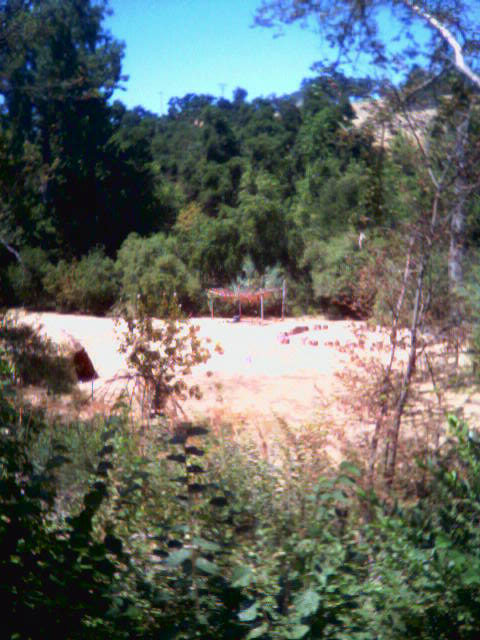
Verizon was having a serious sale on their Samsung SCH-a670 phones, and we couldn’t pass it up. These things are awesome! Beautiful, bright color screens (one inside, one outside). A built-in camera. Polyphonic ringtone capabilities. It’s great. I’ve always wanted to have a low-quality camera with me at all times so I could snap a shot of anything without having to remember to bring my camera, and now I’ve got just that. Steph and I were hiking today and came across a strange deserted encampment in the woods, so I snapped this with the cell-phone’s camera. The image quality isn’t that great, but what do you expect? The lens is about 6mm across in its entirety! I love the fact that I can take a picture of someone, and set it up so that their face shows on the outside screen when they call me. Talk about caller ID! I’ve been going up to all my friends and holding up my phone, “OK, I need to get a shot of you, hold on…”

Everyone we know out here, when they heard we just got cell phones, raised their eyebrows and said, “You mean you didn’t have them already?” I’m starting to get a very strong sense that this isn’t just a communication tool. It’s a culture. It’s part of the Universe of Bling that all the kids are so crazy about. Look at this cell phone ringtone site we had highly recommended to us when we mentioned that we wanted to get better rings for our phones. Please pardon the animated ad on that page, but it truly ads to the atmosphere, doesn’t it? Look at how blingy that young man in the center graphic is. He’s got the ring, the necklace, the lip stud, the dye-job, and the cell phone. It’s all a part of the picture.

So when Steph and I were searching for ringtones this afternoon, I guess I wasn’t surprised that the kids weren’t digging Billy Joel these days. Or even much of U2, although I had better luck there. I think the webpage would have actually eaten me alive if I had tried to search for Peter Gabriel. As it stands, I really love the ringtone I ended up downloading. I’ve also got a special one for Camille, who shares my love of The Darkness, and of course I could hardly stop myself from giving Stephanie “Let’s Get it On” by Marvin Gaye. Yeah baby. Let the bling begin.

Oh, and you can call me when I’m out of the house, too.

Congrats, Neal!

I must take a moment to congratulate Neal, who has blown by me in the number of blog posts he has made. I started this blog 13 months ago, and Neal only started just over 9 months ago and he’s already got 164 published entries compared to my 163.

I don’t anticipate him catching up to me in comments though. I’m about 70% higher. Bwa-ha-ha-haaa!!

Good work Neal! You’re a faithful poster. Now I’m curious to know how many entries Kevin has on his personal blog.